
Brand development · Creative direction · Visual identity
O M
Oneness Mindset.
A lifestyle brand built around movement and presence.
Travel. Train.
Transition.
O M is a lifestyle brand built around movement and presence. Its direction brings travel, training, and everyday life into one connected world, with a focus on how we move through each.
I developed the brand around Travel, Train, Transition: a guiding idea that connects the apparel to the settings and routines it is intended for. It gives the collection a shared purpose across activewear and everyday layers.
As founder and creative lead, my work connects the brand concept, visual identity, apparel direction and presentation, carrying the same point of view from the symbol to the clothing.
Oneness Mindset.
The name is pronounced “Oh Em,” while retaining its connection to Om and the philosophy of Oneness Mindset. The initials give the brand a concise name, while the full phrase carries the idea behind it.
That relationship takes form in the original circular symbol: an O as the head, an M forming the body and arms, and an infinity shape suggesting crossed legs. Together, they reveal a figure in meditation.
The mark makes the philosophy visible. It is both a set of initials and a human figure, connecting the name to the balance of movement and stillness.
A distinct signature.
The stacked O M wordmark gives the brand a direct, recognizable presence on garments. The smaller O above the wider M establishes a deliberate relationship between the two letters.
Centered on the chest in chrome, the stacked mark is the signature treatment for the new apparel direction. Its placement, proportion and finish are part of how the clothing will be recognized.
The stacked wordmark and circular symbol express two sides of the same identity: movement and stillness, physical expression and inner awareness.
Fit. Proportion.
Presence.
The apparel brings together coordinated activewear and fleece separates, with attention to fit and proportion. Matching tops and leggings sit within a broader direction that includes cropped hoodies and fleece outfits.
The current site imagery establishes the silhouette reference for the developing collection. My focus is on bringing the pieces toward that consistent direction through their shape, proportions and branding.
I am working directly with the factory on the next pieces, connecting the intended visual presentation to the garments being developed.
One connected world.
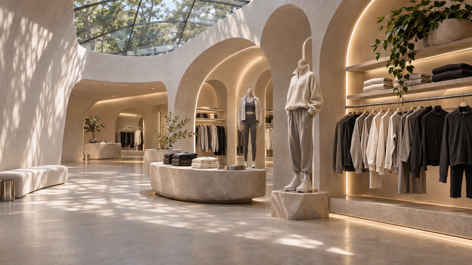
The digital presentation extends O M beyond individual product images. Warm architectural forms, illuminated arches and a restrained palette create a setting where activewear and fleece belong together.
The boutique concept brings that relationship into view: garments, displays, materials and space share the same visual direction. It provides a way to communicate the brand’s atmosphere alongside the clothing.
The result is a connected presentation of the name, identity and apparel, with Travel, Train, Transition as the thread running through it.
Brand concept. Visual identity.
Apparel and collection direction.
Factory collaboration. Digital presentation.